Sick of Boring Meetings that Waste Your Time?
Last month I began a discussion about common-cause strategies ("Real Common Cause," August 2005). Sometimes, hidden special causes--that aggregate predictably to create the appearance of common cause--can be exposed, either when there's an underlying structure to how the data were collected or when one can somehow code each individual data point with a trace to a process input. (The color coding of a graph can be every bit as effective as the more formal tool of a stratified histogram.)
I'm going to take this issue further by looking at two scenarios of "count" data. If count data charts exhibit common cause, the same strategy as above initially applies; however, there's an additional tool, not commonly taught, that's most enlightening.
I once consulted with a medical center and attended its monthly meeting on medication errors. I had the reports from the past two years, and at the top of each report was the number of errors for this month, last month and same month last year.
I tuned out the people asking, "What's the trend?" and used the reports to sketch a quick run chart of the past three years of performance. It looked like this:
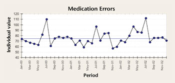
Common cause… but do you see a pattern to the months with high values? I stopped the meeting dead in its tracks by asking, "What happens in July?" Turns out, besides a lot of vacations, that's when the new residents start. Do you think that might be the reason?
Let's look at a similar meeting. A manufacturing plant had 45 accidents one year and set a goal for the next year of reducing them by at least 25 percent. The subsequent total was 32--a 28.9-percent decrease. In fact, a trend analysis showed the decrease was more on the order of 46.2 percent (4.173 vs. 2.243).

Kudos to the safety committee and its monthly safety meeting, where each individual event is dissected--i.e., each undesirable variation (or accident) is treated as a special cause. There are three months with zero events. The reasons for this were discussed (and darned if they weren't found) and implemented. Based on these data, 80 actions (reactions to 77 accidents plus three months of zero) have been implemented during the past two years, including new policies, new reporting forms, new awareness posters, additional visual safety alerts in "dangerous" places and plant safety meetings.
Key question: Is the process producing 32 accidents different from the process that produced 45 accidents? If the answer is yes, one should be able to create a run chart of individual monthly results and see at least one of three things: a trend of seven going downward and/or a run of eight consecutive points above the median in the first year and/or a run of eight consecutive points below the median in the second year. I see none of those in the following chart:
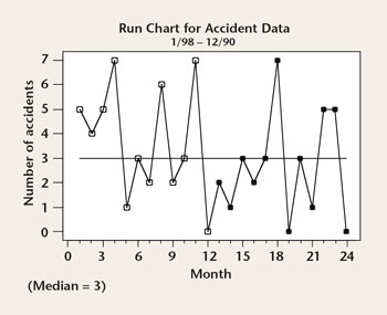
Common cause! The special-cause strategy of looking at each accident individually (and scraping it like a piece of burnt toast) is wrong--which the chart confirms. The process hasn't improved; it's perfectly designed to produce accidents.
Suppose that no coding of the individual observations helped? What now--a common occurrence with incident data or nonconformance data? One doesn't have to accept this level of performance but, to quote a favorite saying of W. Edwards Deming's, "Statistics on the number of accidents doesn't improve accidents."
The fact that the plot demonstrates common cause means that neither individual monthly points nor individual accidents can be treated as special cause.
To be continued…
Davis Balestracci is a member of the American Society for Quality. He previously served as chair of the statistics division of ASQ. His book, Quality Improvement: Practical Applications for Medical Group Practice (Center for Research in Ambulatory Health Care Administration, 1994), is in its second edition. Visit his Web site at www.dbharmony.com.
|