Some Thoughts on Benchmarking (Part 2)
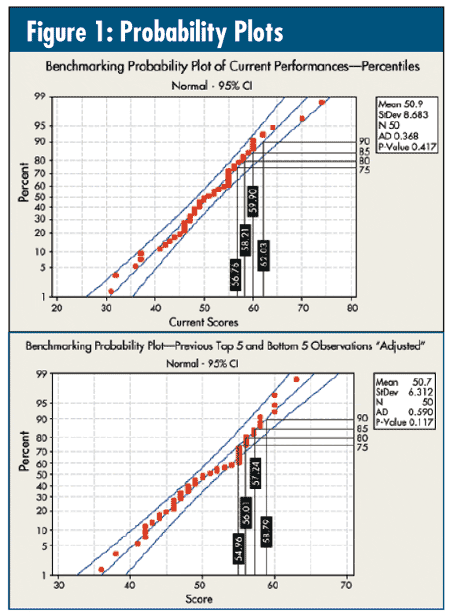
Here's a typical "benchmarking" plot I see a lot. In figure 1, the top plot is the performance data from last month's column ("Some Thoughts on Benchmarking [Part 1]"). Do they tell the same story? They both pass the test for normality, their data are all within the 95-percent confidence band, and the 75th, 80th, 85th and 90th percentilesare pretty close.
Actually, they're worthless.
Last month's data were generated by simulating 40 observations of 100 binomial events with p = 0.5, then generating five observations at p = 0.25 (below-average performers) and another five at p = 0.75 (above-average performers)--three distinctly different levels of performance with the potential to find true opportunity.
The graph on the bottom retains the exact same 40 observations for p = 0.5, but I then simulated five each "high" and "low" observations at p = 0.5, which means that there are no differences to be found if these data are benchmarked.
Take a look at figure 2. In analyzing the data appropriately via an np chart analysis of means (ANOM)--organizations numbered 6-45 have the exact same data in each graph--the top graph exposes two of the five high-performing organizations (Nos. 46-50) and two of the five low-performing organizations (Nos. 1-5). Note that one average organization, No. 6, has performance that's worse than three of the below-average performers (Nos. 3-5), and three average organizations (Nos. 43-45) have performance better than one of the above-average performers --No. 46. However, at this point, other than organizations 1-2 and 44-45, the other 46 organizations are indistinguishable.
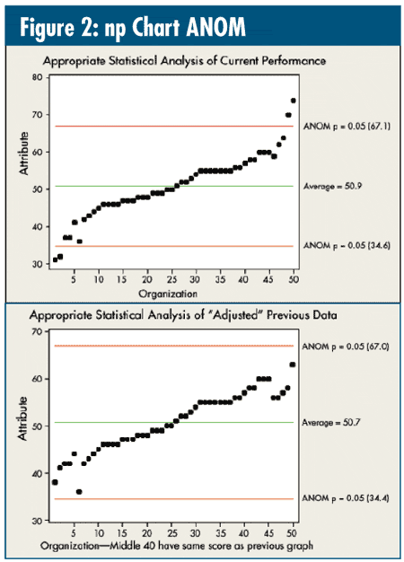
The bottom graph, as should be expected, shows no exposed outliers, but it results in tables similar to last month's column. Consistent 75th, 80th or 90th percentile performance is impossible. Unfortunately, those looking for reasons for these alleged differences will find them.
Looking at last month's table, consider average organizations like No. 7, which dropped 28 places in the rankings, and No. 41, which improved 36 places. Both were statistically significant changes from the baseline that mean nothing.
If one does want to deal with the two sets of rankings, then why not analyze them as described in my September 2006 column ("A Handy Technique")? In figure 3, note how the above-average and below-average clusters of five are getting more distinctive. Nothing else (Nos. 6-45) is really that close.

I recently encountered the following performance goal: "The target is for 90 percent of the bottom quartile to perform at the 2004 average by the end of 2008."
Do you really want to continue to pay "benchmarking services" to help you achieve such goals?
Davis Balestracci is a member of the American Society for Quality and past chair of its statistics division. Visit his Web site at www.dbharmony.com.
|