There are right and wrong ways of computing limits. Many technical journals and much software use the wrong methods.
by Donald J. Wheeler
Good Limits From Bad Data (Part I)
Charles, from the home office, was pushing the plant manager to start using control charts. The plant manager didn't know where to start, so he asked what he should be plotting. Charles responded that he might want to start with the data they were already collecting in the plant.
To start, they checked the log sheet for batch weights -- a page where the mix operators had written down the weight of each batch they produced. Charles began to plot the batch weights on a piece of graph paper. After filling up the first page, he computed limits for an XmR chart. Of course, the chart was out-of-control and the process was unpredictable. Even though every batch was weighed and the operators wrote down each weight, the log did not enable them to produce batches with consistent weights. Unpredictable weights meant that the formulation was changing in unpredictable ways, which translated into a sense of fatalism downstream.
How could Charles determine that the process was unpredictable when he was using the data from the unpredictable process to compute the limits? The answer has to do with the way the limits are computed. There are right and wrong ways of computing limits. This column illustrates this difference for the XmR chart.
The first 20 batch weights were:


|
920 |
925 |
830 |
855 |
905 |
925 |
945 |
|
915 |
940 |
940 |
910 |
860 |
865 |
985 |
|
970 |
940 |
975 |
1,000 |
1,035 |
1,040 |
The central line for the X chart is commonly the average of the individual values. For these 20 values, the average is 934. (Alternate choices for the central line are a median for the individual values or, occasionally, when we are interested in detecting deviations from a norm, a target or nominal value.)
Both of the correct methods for computing limits for the XmR chart begin with the computation of the moving ranges. Moving ranges are the differences between successive values. By convention, they are always non-negative. For the 20 data above, the 19 moving ranges are:
|
5 |
95 |
25 |
50 |
20 |
20 |
|
|
30 |
25 |
0 |
30 |
50 |
5 |
120 |
|
15 |
30 |
35 |
25 |
35 |
5 |
Correct Method 1:
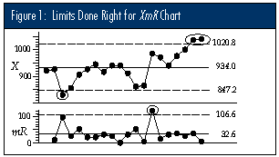
The most common method of computing limits for XmR charts is to use the average moving range, which is commonly denoted by either of the symbols: R or mR. The limits for the X chart will be found by multiplying the average moving range by the scaling factor of 2.660, and then adding and subtracting this product from the central line. For these data, the average moving range is: mR = 32.63, so multiplying by 2.660 gives 86.8, and the limits for the individual values are placed at: 934 ± 86.8 = 847.2 to 1,020.8.
The upper limit for the moving range chart is found by multiplying the average moving range by the scaling factor 3.268. For these data, this limit is 106.6. Figure 1 shows the XmR chart for these 20 batch weights. (Notice that the chart in Figure 1 shows three separate signals of unpredictable variation, even though the data from the unpredictable process were used to compute the limits.)
Correct Method 2:
The other correct method of computing limits for a chart for individual values is to use the median moving range, which is commonly denoted by either of the symbols: R or mR. The limits for the X chart may be found by multiplying the median moving range by the scaling factor of 3.145, and then adding and subtracting this product from the central line. For these 19 moving ranges, the median moving range is mR = 30.
Multiplying by the scaling factor of 3.145 gives 94.4, and the limits for the X chart are placed at: 934 ± 94.4 = 839.6 to 1,028.4. The upper limit for the mR chart is: 3.865 x 30 = 116.0.
These limits are slightly wider than those in Figure 1. However, the same points that fell outside the limits in Figure 1 would still be outside the limits based upon the median moving range. There is no practical difference between these two correctly computed sets of limits.
An incorrect method:
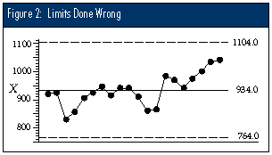
A common, but incorrect, method for computing limits for an X chart is to use some measure of dispersion that is computed using all of the data. For example, the 20 data could be entered into a statistical calculator, or typed into a spreadsheet, and the standard deviation computed. The common symbol for this statistic is the lowercase letter "s." For these data: s = 56.68.
This number is then erroneously multiplied by 3.0, and the product is added and subtracted to the central line to obtain incorrect limits for the X chart: 934 ± 170.0 = 764 to 1,104. Figure 2 shows these limits.
Notice that the chart in Figure 2 fails to detect the signals buried in these data. It is this failure to detect the signals which are clearly indicated by the other computational methods that makes this approach incorrect.
Note that it is the methodology of computing a measure of dispersion, rather than the choice of dispersion statistic, that is the key to the right and wrong ways of obtaining limits. If we used the range of all 20 data (1,040 &endash; 830 = 210), we would obtain incorrect limits of: 934 ± (3)(210)/3.735 = 934 ± 168.7 = 765.3 to 1,102.7, which are essentially the same as in Figure 2.
Conclusion
The right ways of computing limits will allow us to detect the signals within the data in spite of the fact that we used the data containing the signals in our computations. They are always based upon either an average or median dispersion statistic.
The wrong ways of computing limits will inevitably result in inflated limits when signals are present within the data, and thus they will tend to hide the very signals for which we are looking. The wrong ways tend to be based upon a single measure of dispersion that was computed using all of the data.
This distinction between the right and wrong ways of computing limits has not been made clear in most books about SPC, but it was there in Shewhart's first book. Many recent articles and software packages actually use the wrong methods. I can only assume it is because novices have been teaching neophytes for so many years that the teaching of SPC is out of control.
About the author
Donald J. Wheeler is an internationally known consulting statistician and the author of Understanding Variation: The Key to Managing Chaos and Understanding Statistical Process Control, Second Edition. © 1996 SPC Press Inc. Telephone (423) 584-5005.
|
[Homepage] |
|
[About Us] |
Copyright 1997 QCI International. All rights reserved. Quality Digest can be reached by phone at (916) 893-4095.
Please contact our Webmaster with questions or comments.
March 97 Quality Digest