I Hate Bar Graphs--Part 3: Odds and Ends
I can't leave the subject of bar graphs without talking about several other very common scenarios I encounter.
Figure 1 shows three graphs of the same data (percent computer uptime). The one at the top uses an origin of zero (which is more common than you'd think). The middle graph lets the program default to a scale. Contrast these with the run-chart analysis at the bottom: No trends, no runs of eight and nothing unusual about achieving 100 percent... merely luck. Common-cause strategy, anyone (matrix of downtime)?
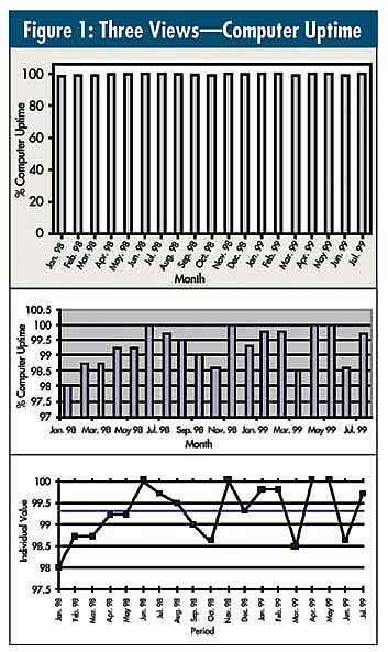
Figure 2 shows a stacked bar graph (top) with 19 "dots" that can, with little effort, be converted to a run chart (bottom).
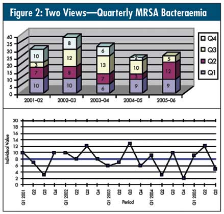
The run chart tells the story quite well: Nothing's changed for five years, despite a lot of well-meaning improvement efforts. Similar to figure 1, would a matrix analysis of all 150 bacteraemias be helpful?
When speaking at conferences, I'm always intrigued when I visit the poster sessions--countless aisles of bar graphs (when there's even data on display). Just once, I'd like to take a cigarette lighter and ignite any bar graph I see, especially the displays with two bars--"before" and "after."
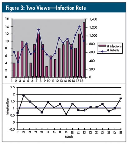
I've noticed that the "two-scale" syndrome seen in figure 3 is also very common. Note the differing left and right vertical axes. The horizontal axis is "time." This poster touted a profound change, but a run chart of the rate showed otherwise.
When are we going to stop taking the easy way out by giving in to what our customers "expect" or, worse, staying silent and tolerating meetings where useless displays like the example above and those shown in my past two columns result in destructive managerial actions? This kind of display does no one--least of all quality professionals--any favors. So, to quote the famous clip from the movie Network, join me:
"I want you to get mad!… All I know is that first, you've got to get mad!… So, I want you to get up now. I want all of you to get up out of your chairs. I want you to get up right now and go to the window… open it… and stick your head out and yell, 'I'm as mad as hell… and I'm not going to take this any more!'"
And keep a lighter handy.
Davis Balestracci is a member of the American Society for Quality and past chair of its statistics division. Visit his Web site at www.dbharmony.com
|