A Blinding Flash of the Obvious
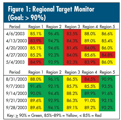
If you need further proof that government agencies can keep meticulous track of the unnecessary, take a look at the data in figure 1. This chart was sent to a government agency every week for monitoring an arbitrary target that had been set. There were 28 regions; for the sake of brevity, I've chosen five of them and given the first and last five weeks of data so you'll have an idea of what was presented at the meetings—for this particular week, a 26-by-28 matrix of numbers—and what received a reaction (no doubt with "little circles").
What might be a better alternative? Some of you might say, "How about a comparative histogram?" See figure 2: simple, obvious—and wrong. How do I know this? Because I "plotted the dots" to assess the processes first and found out that not all of them were stable, which invalidates this graph and would also invalidate any attempt to do an analysis of variance (ANOVA) using all the data.
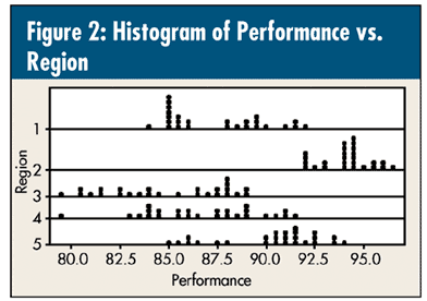
Figure 3 is so much better. An initial control-chart analysis was used to determine shifts, and the data are shown with their respective shifts. But more important , all five regions are on the same scale.
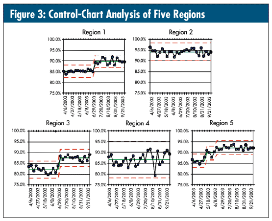
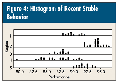
Note the difference of the histogram in figure 2 with the one in figure 4 that uses the most recent stable history (region 1—last 13 observations; region 2—all the data; region 3—last 13 observations; region 4—all the data; and region 5—last 13 observations). This, along with the control-chart analysis in figure 3, provides an excellent summary. The graphs say it all. By the way, did you notice that region 4's variation is approximately 2.5 times greater that of the other regions?
From past columns, you know that I'm a fan of Ellis Ott's analysis of means (ANOM). (I do hope you read the excellent article about him, "'Pl-Ott the Data!'" by Dean V. Neubauer, Quality Digest, May 2007.) I've used ANOM to look for differences in performance with data expressed as aggregated percentages or rates.
With this type of data, things aren't so clear because, as the control charts in the figures show, continuous data can't always be appropriately aggregated into their calculated "average."
So this is what you might call a "partial" ANOM. That's probably good enough for the purposes of most people—plotting the things they're comparing on the same page and the same scale.
You've "plotted the data" and, as Professor Ott might have said, "Now you can think." For those of you who want to see a more formal ANOM, I'll revisit these data next month.
Davis Balestracci is a member of the American Society for Quality and past chair of its statistics division. He would love to wake up your conferences with his dynamic style and unique, entertaining insights into the places where process, statistics, and quality meet. Visit his Web site at www.dbharmony.com.
|