Asking the Right Questions
A hospital’s quality assurance director decided to establish a standard regarding Caesarian sections. The local statistical guru (LSG) performed a test for normality on 48 months of data, and it passed (p-value of 0.412). But he warned, “By accepting the null hypothesis, one cannot say that the data are normal, only that they cannot be proven to be non-normal.”
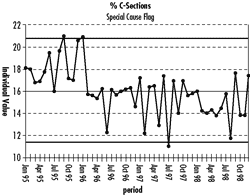
The LSG had a cynical reaction when asked to produce a control chart. “It’s just a time-ordered plot with three standard deviations on either side of the average. Since the data are normally distributed and all the points are within three standard deviations of the average, what else do you need to know? Why don’t you just use two standard deviations without the chart and you will see that months 9, 12, 13, and 31 need to be investigated.”
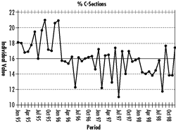
A person who recently attended an SPC training course said that the overall standard deviation [+/-(3 x 2.23)] must never be used for control chart limits. So she used the average moving range to determine the limits [+/-(2.66 x 2.145)], which tightened a bit--but still no points outside the limits. Meanwhile, a recent attendee at a prestigious health care improvement conference was taught to use the median moving range to calculate control limits [+/-(3.14 x 1.5)] which produced the chart below:
The LSG smirked, but was silently befuddled as to how a three-standard deviation analysis could be almost equivalent to his two-standard analysis.
All three have missed the point--as will most “guru” versus “guru” arguments about control chart mechanics and “two- versus three-standard deviation” debates.
I have come to appreciate, as an initial analysis, the power of merely plotting data in its naturally occurring time order without control limits, and with the median of the data drawn in--a run chart.
One of the most powerful rules in analyzing a process run chart is looking for a cluster of eight consecutive data points either all above or below the median. This indicates the presence of a process shift somewhere in the data, making it inappropriate to calculate the overall average (or standard deviation) of the data.
Observations 35-44 are below the median, but this doesn’t mean that a special cause occurred--only that the process exhibited at least one shift during the timeframe. The goal is to avoid statistical dogmatism and to use one’s knowledge of process history to determine where an event may have occurred to cause a shift. Isn’t it obvious that something happened after observation 13?
In quality improvement, a good analysis always suggests the next question. Upon inquiry about what happened at month 13, I learned that the doctors had begun getting feedback on their individual C-section rates, which seems to have had an effect.
This process actually had two averages, rendering the initial test for normality worthless and inflating the LSG’s overall standard deviation calculation.
Since the data exhibit the behavior of two “systems” (one of 13 months and one of 35 months), does a run chart of the latter remain stable after the obvious change?
The process has shifted in performance from 18.4 percent to 15.2 percent, and calculation would show it currently in statistical control, i.e., stable and predictable, in an expected monthly range between 10.1 percent and 20.2 percent.
So what should the standard be?
Wrong question! There happen to be 15 doctors practicing at this hospital, so we’re not finished--but that’s another column.
Never underestimate the power of initially plotting any set of data in its naturally occurring time order and using a run chart analysis to see whether you have the privilege of calculating the average. You will begin asking different (and more relevant) questions. Bar graphs, normality tests, and static summaries are virtually worthless as initial analyses.
Davis Balestracci is a member of the American Society for Quality and the Association for Quality and Participation. He previously served as chair of the statistics division of ASQ. His book, Quality Improvement: Practical Applications for Medical Group Practice (Center for Research in Ambulatory Health Care Administration, 1994), is in its second edition. Visit his Web site at www.dbharmony.com.
|