|
Median control charts -- also known as  control charts -- are used to fill the vacuum between individuals charts and averages charts ( control charts -- are used to fill the vacuum between individuals charts and averages charts ( charts). Averages charts, accompanied by either range charts or sigma charts, are the SPC tool of choice for variables data. The advantages of using charts include the normalizing effect of the central limit theorem, sensitivity at whatever level is desired by adjusting subgroup size, optimal estimation of process variation through rational subgrouping, graphical control of dispersion, and independence of points on the chart, which makes run testing possible. When it is not possible to use charts, individuals charts are usually employed along with the moving range chart. charts). Averages charts, accompanied by either range charts or sigma charts, are the SPC tool of choice for variables data. The advantages of using charts include the normalizing effect of the central limit theorem, sensitivity at whatever level is desired by adjusting subgroup size, optimal estimation of process variation through rational subgrouping, graphical control of dispersion, and independence of points on the chart, which makes run testing possible. When it is not possible to use charts, individuals charts are usually employed along with the moving range chart.
However, sometimes charts can't be used. For example, perhaps the level of work force training is not yet sufficient for the calculations involved. Under these conditions, there is no economic or scientific justification for failing to use charts, and they could, in principle, be used. Under the circumstances, charts offer an alternative that may be preferable to individuals charts. Like charts, charts can be made more sensitive by increasing the subgroup size.
These steps will help you prepare charts:
 Determine the subgroup size and sampling frequency. Typically, subgroups of three, five or seven units are used, and subgroups of five are most common. Odd-sized subgroups are usually selected because no calculations are necessary when the subgroup size is odd. The subgroup size affects the sensitivity of the control chart. Smaller subgroups create a control chart that is less sensitive to changes in the process, while larger subgroups may be too sensitive to small, economically unimportant changes. When using x charts, the subgroup size should be kept small -- nine or less. Median charts are less efficient statistically than charts, and the inefficiency increases as the subgroup size increases. Determine the subgroup size and sampling frequency. Typically, subgroups of three, five or seven units are used, and subgroups of five are most common. Odd-sized subgroups are usually selected because no calculations are necessary when the subgroup size is odd. The subgroup size affects the sensitivity of the control chart. Smaller subgroups create a control chart that is less sensitive to changes in the process, while larger subgroups may be too sensitive to small, economically unimportant changes. When using x charts, the subgroup size should be kept small -- nine or less. Median charts are less efficient statistically than charts, and the inefficiency increases as the subgroup size increases.
If possible, collect data from 20-25 subgroups, with at least 100 individual values. While the data is being collected, minimize disturbances to the process. If a process change is unavoidable, develop a system for recording changes so that their effect can be determined. Make notes of all changes directly on the chart.
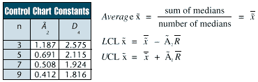
Compute the control limits using the following equations. Choose the  2 constant based on your subgroup size, n. 2 constant based on your subgroup size, n.
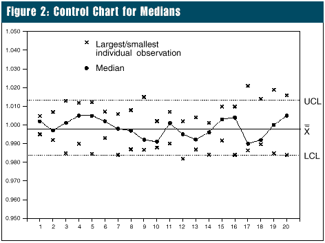
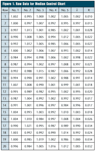 Example: Figure 1 shows the raw data. Because each subgroup contains five observations, the subgroup x is simply the middle, or third largest (or third smallest), value in the subgroup. Figure 2 shows the completed control chart. On x charts, the smallest and largest points are plotted. The chart clearly identifies the value of each subgroup. A line joins the values. The range chart must be used during the initial capability study to determine if the process dispersion is in control. The Example: Figure 1 shows the raw data. Because each subgroup contains five observations, the subgroup x is simply the middle, or third largest (or third smallest), value in the subgroup. Figure 2 shows the completed control chart. On x charts, the smallest and largest points are plotted. The chart clearly identifies the value of each subgroup. A line joins the values. The range chart must be used during the initial capability study to determine if the process dispersion is in control. The  value from the range chart is also used to find the control limits for the chart. value from the range chart is also used to find the control limits for the chart.
When using control charts, remember these pointers:
Be timely! These charts are tools to assist you with process improvement by highlighting the existence of special causes. It does very little good to know that a special cause existed yesterday -- you must know that it is happening now. Unless you're timely, you will never be able to identify the special cause; it will be a "ghost." To assist you in finding ghosts, frequent small samples generally are better than occasional large samples.
Log in as much background information as possible. The background data will be very helpful in analyzing patterns that would otherwise seem random.
For example, one lathe operator noticed that cold air blasted in a door every time a new load of material came in, and he noted this fact on his control chart. After a few days, it was clear that this caused variation in the size of the parts being made on the lathe. However, this discovery would never have been made without the operator's diligence.
Write comments on the chart form itself. The most useful control charts usually are not the cleanest ones -- because they're the ones that have been used.
Be an active investigator. Using control charts to "study history" will only get you half of their potential benefit. If you deliberately try different things, and note these things on the charts, you'll greatly accelerate the learning process.
For example, if you have materials from two different sources, group one vendor's material together for several subgroups and the other vendor's material for several more, making a note of this on the control charts. If there is a difference, you've uncovered a cause of variation, and you can make an immediate improvement.
When a point is out of control, check the easiest things first, e.g., ensure that the math was done correctly and that the point is plotted where it should be plotted. You should have a written procedure or flowchart describing the steps to take when a subgroup x falls beyond a control limit. The procedure should also describe the action to take if the special cause can't be found.
About the author
Thomas Pyzdek is president and CEO of Pyzdek Management Inc. He has written hundreds of articles and papers on quality topics and has authored 13 books, including The Complete Guide to the CQM. Comments can be e-mailed to him at Tom Pyzdek . |