A Graphical Approach to ANOM
You know that I’m a fan of Ellis Ott’s analysis of means (ANOM) and have demonstrated its use in looking for differences in performance with data expressed as percentages or rates.
However, with continuous data such as those in last month’s column ("A Blinding Flash of the Obvious"), the technique isn’t so clear-cut. It results in the graph in figure 1, which, in my opinion, leaves a lot to be desired -- and isn’t the easiest graph for the statistical novice to obtain.
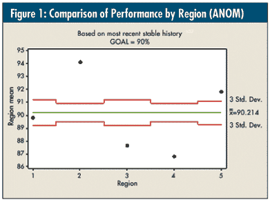
Because of the different sample sizes in each group (n = 13, 26, 13, 26, and 16, respectively), the upper and lower decision limits are set at three standard deviations (i.e., "good enough"). This graph is an attempt to compare each region’s performance vis-à-vis their overall average of 90.2 percent. However, there’s another complicating factor.
Before I performed the ANOM, I tested the equality of variances -- on the most recent stable system for each region -- using the Levene test, which is available with most software packages and is robust to non-normality. It showed that region 4’s variance was an outlier (i.e., more than twice as variable), and the other four were, in essence, equal. So, I pooled regions 1-3 and 5 to obtain a standard deviation of 1.22, which is what was used for this graph. Region 4 definitely needs to be part of the comparison, but its limits can’t really be interpreted.
To demonstrate this in a fashion that more accurately reflects the philosophy of ANOM and takes care of region 4’s variation problem, the five graphs in figure 2 are once again on the same scale as last month; however, what I’ve done is to compare their most recent stable performance to the average of the other four regions -- i.e., the specific region’s data are omitted from the average calculation on its graph, and this resulting average is "forced" in as the center line for the region’s most recent stable data.
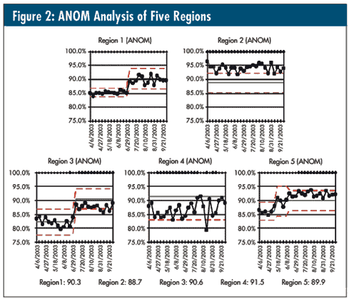
This allows one to see how each region performs vs. the other four. We can now use control-chart theory to observe whether there are special causes for that region vs. that average and determine whether the region is indeed "average" (region 1), "above average" (regions 2 and 5), or "below average" (regions 3 and 4). The "omitted" averages for each region are included.
When region 4 is plotted vs. the grand average of regions 1-3 and 5 with its unique variation, it becomes quite obvious that it is indeed below average despite it having more than twice the other regions’ variation.
As I also said last month, these data were collected during a time when the goal for this indicator was 90 percent. Did you happen to notice that the goal didn’t come up at all in the analysis? Given the plot from last month’s column along with the one in figure 2, might the conversation be more productive than just the weekly comparison to "red, yellow, and green"? Might it even lead to some meaningful action?
Davis Balestracci is a member of the American Society for Quality and past chair of its statistics division. He would love to wake up your conferences with his dynamic style and unique, entertaining insights into the places where process, statistics, and quality meet. Visit his Web site at www.dbharmony.com .
|