Good Limits From Bad Data (Part II)
by Donald J. Wheeler
Continuing the theme from last month, this column will illustrate the difference between the right and wrong ways of computing limits for average charts.
We begin with a data set consisting of k = 6 subgroups of size n = 4:]
|
Subgroup |
-1- |
-2- |
-3- |
-4- |
-5- |
-6- |
|
Values |
4 |
0 |
8 |
6 |
3 |
8 |
|
5 |
2 |
4 |
9 |
2 |
7 |
|
|
5 |
1 |
3 |
9 |
0 |
9 |
|
|
4 |
5 |
7 |
7 |
3 |
9 |
|
|
Averages |
4.5 |
2.0 |
5.5 |
7.75 |
2.0 |
8.25 |
|
Ranges |
1 |
5 |
5 |
3 |
3 |
2 |


The central line for the average chart (also known as an X-bar chart) is commonly taken to be the grand average. For these data, the grand average is 5.00.

Average charts done right
The most common method of computing limits for average charts is to use the average range. The limits for the average chart may be found by multiplying the average range by the scaling factor A2, and then adding and subtracting this product from the central line.
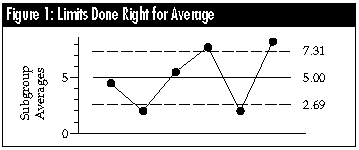
For these data, the average range is 3.167 and the value of A2 for subgroup size n = 4 is 0.729, therefore the product is 2.31, and the limits for the average chart are: 5.00 ± 2.31 = 2.69 to 7.31.
Instead of using A2 times the average range, you may use any one of several alternatives as long as you use the correct scaling factors. Some appropriate substitutions are: A4 times the median range (2.27), A1 times the average RMS deviation (2.44) and A3 times the average standard deviation (2.44).
While there are other valid alternatives, the four above are the ones most commonly used. Tables of the scaling factors are found in most textbooks on SPC. No matter which of the computational alternatives is used, the chart looks the same: Subgroups 2 and 5 have averages below the lower limit, and subgroups 4 and 6 have averages above the upper limit.
Thus, all of the correct ways of computing limits for an average chart allow you to obtain good limits from bad data -- that is, we are able to detect the lack of statistical control even though we are using the out-of-control data to compute the limits. Of course, this property is subject to the requirement that the subgrouping is rational -- that each subgroup is logically homogeneous. As Shewhart observed, the issue of subgrouping is essentially a matter of judgment. Based on the context for the data, we must be able to argue that the values collected together within any one subgroup can be thought of as having been collected under essentially the same conditions. For more on this topic, see this column in the April 1996 issue of Quality Digest.

Average charts done wrong
Perhaps the most common mistake made in computing limits for an average chart is the use of a single measure of dispersion computed using all of the data. If all 24 values were entered into a spreadsheet or statistical calculator, and the standard deviation computed, we would get the value: s = 2.904.
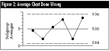
When this global measure of dispersion is used (inappropriately) to compute limits for an average chart, it is divided by the square root of the subgroup size and multiplied by 3.0. This would result in a value of 4.356, which would yield incorrect limits for the average chart of: 5.00 ± 4.36 = 0.64 to 9.36.
This method of computing limits for the average chart is wrong because it results in limits that do not detect the signals contained in the data. This approach gives you bad limits from bad data because the computation of a single measure of dispersion using all of the data makes an implicit assumption that the data are globally homogeneous. In short, this computation assumes that there is no possibility of any signals within the data, and so it makes sure that you do not find any signals.

Average charts done very wrong
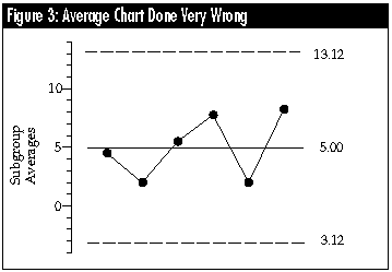
The second most common mistake in computing limits for an average chart is the use of a single measure of dispersion computed using all of the subgroup averages. If the six subgroup averages were typed into a spreadsheet or entered in a statistical calculator, and the standard deviation computed, we would get the value: s = 2.706. Because this is the standard deviation of the subgroup averages, it is (inappropriately) multiplied by 3.0 and used to construct incorrect limits for the average chart of: 5.00 ± (3.0) (2.706) = 5.00 ± 8.12 = 3.12 to 13.12.
This method of computing limits does not just bury the signals, it obliterates them. Once again, we get bad limits from bad data. The calculation of the standard deviation of the subgroup averages implicitly assumes that the subgroup averages are globally homogeneous; that is, they do not differ except for noise. Because this method assumes that there is no possibility of any signals within the data, it makes sure that you do not find any signals.
Conclusion
The only way to get good limits from bad data is to use the correct computational approaches. These correct methods all rely upon either an average dispersion statistic or a median dispersion statistic and the appropriate scaling factor.
The wrong methods tend to rely upon a single measure of dispersion computed on a single pass, using either all the data or all the subgroup averages.
The distinction between the right and wrong ways of computing limits was first made by Shewhart on page 302 of his book, Economic Control of Quality of Manufactured Product (ASQC Quality Press). It should not be an issue some 65 years later. The fact that it is an issue suggests that many people who think they know about control charts didn't get the message.
How can you tell the difference? You can use any out-of-control data set to evaluate software packages -- they should agree with the limits computed by hand. Or you can look at the formulas or computations used: If the limits are based upon any measure of dispersion that doesn't have a bar above it, then the limits are wrong. So, if you now catch someone using any other way than one of the scaling factor approaches, then you know, beyond any doubt, that in addition to being wrong, they are also either ignorant or dishonest.
About the author
Donald J. Wheeler is an internationally known consulting statistician and the author of Understanding Variation: The Key to Managing Chaos and Understanding Statistical Process Control, Second Edition. © 1997 SPC Press Inc. Telephone (423) 584-5005 or e-mail dwheeler@ qualitydigest.com.
|
[Homepage] |
|
[ISO 9000] |
|
[About Us] |
Copyright 1997 QCI International. All rights reserved. Quality Digest can be reached by phone at (916) 893-4095.
Please contact our Webmaster with questions or comments.