|
Using Excel Control Charts Spreadsheets can actually exceed by William A. Levinson, P.E.
Dorner shows how to make Shewhart charts for applications with constant sample sizes. When sample sizes are not constant, however, control limits must vary with sample size. Few, if any, commercial SPC packages handle these applications. It is easy, however, to program a spreadsheet to accept varying sample sizes (Levinson and Tumbelty, 1997, pages 197-201). This article explains how to do this. Control charts for variables (continuous scale) data use the sample average to monitor the process mean. They use the sample range (R) or standard deviation (s) to detect changes in process variation. The s chart is better because it uses the entire sample and not just the largest and smallest values. The R chart, however, is more practical when operators must do the calculations by hand. Because we will be using a spreadsheet, ease of computation is not a consideration. Although all pertinent charts are shown in this article, it is best understood if used in conjunction with the Excel file that can be downloaded from the Quality Digest Web site at www.qualitydigest.com/pdfs/empiric.xls . To make the spreadsheet more accessible to older Excel versions, and to improve importability to Quattro Pro and Lotus 1-2-3, it has been saved on a single worksheet in Excel 4.0.
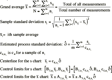
Empirical control charts To construct an empirical control chart, one based on actual process data, first estimate the process mean and standard deviation using the following formulas. Begin with a process history of m rational subgroups. The ith subgroup contains ni measurements. c4 is a control chart factor that depends on the sample size. We will also use A3, B3 and B4, which also depend on the sample size. The control chart factors can be found on Table 3 of the Excel spreadsheet downloaded from the Quality Digest Web site. The grand average is always the centerline of the
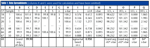
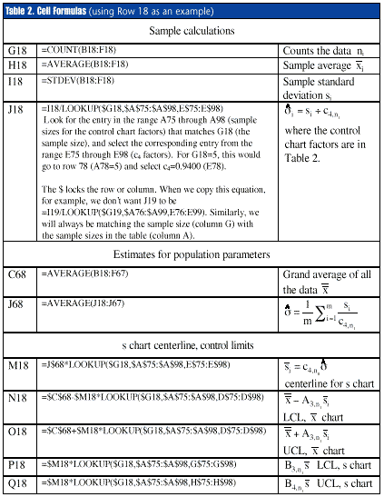
Spreadsheet calculations The spreadsheet in Table 1 accepts subgroups of two to five measurements, which are input into columns B18 through F67. If there can be more than five measurements, simply add more columns (columns K and L). Table 2 shows the formulas needed for each cell, using row 18 as an example.
To simplify the chart for operators, hide columns that contain only intermediate calculations. The user does not need column J or M (s/c4 and
Making the charts Use the chart Wizard to create the control charts (select "line chart" within the Wizard). For the s chart shown in Figure 1, plot columns I, M, P and Q, rows 17 through 67 (s, s, LCL, UCL, in Figure 1). The user can select line styles, colors and markers for each parameter. In this example, the lower control limit is zero because the sample sizes are five or less. The centerline and the upper limit, however, vary in response to the sample size. For the x-bar chart shown in Figure 2, plot H, N, O and C$68 (
Zone tests The spreadsheet can perform the Western Electric zone tests automatically. Table 4 shows how to detect eight consecutive points above or below the
Sample calculations: R56: {=MAX(SUM(1*($H49:$H56> $C$68)),SUM(1*($H49:$H56<$C$68)))} "Maximum of (Points out of the last eight above the centerline, points below the centerline)" The brackets denote an array summation; press Control-Shift-Enter when entering the formula. When copied into R57, for example, the formula changes to {=MAX(SUM(1*($H50:$H57>$C $68)), SUM(1*($H50:$H57<$C$68)))}
S56: {=1*(MAX(SUM(1*($H49:$H 56>$C$68)),SUM(1*($H49:$H56<$C$6 8)))>=8)} This is like R56, but a little more sophisticated. If there is a run of eight points above or below the centerline, the result is 1. Otherwise, it is zero. The cell format is: [=0]" ";[=1]"Zone C" That is, a blank space if zero, "Zone C" if one; the point fails the Zone C test.
Similar automatic detection works for the other zone tests. To perform the Zone A test in row 57, for example, use the formula {=1*(MAX(SUM(1*($H55:$H57> ($C$68+0.667*($C$68$N57)))), SUM(1*($H55:$H57<($C$680.667* ($C$68-$N57)))))>=2)} Cell format is: [=0]" ";[=1]"Zone A" That is, are two or more of the last three points above the centerline plus two standard deviations (two-thirds of the distance between the centerline and a control limit)? Are two or more of the last three points below the centerline minus three standard deviations?
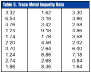
Application to non-normal data Spreadsheets can even handle control charts for non-normal distributions like the gamma and Weibull distributions. A one-sided specification often points to a non-normal distribution. Levinson (1997) shows, for example, that impurities in chemicals often follow the gamma distribution. The specification is one-sided; the customer does not care how few impurities it gets. The impurities are "undesirable random arrivals," the Poisson distribution models discrete random arrivals, and the gamma distribution is the continuous-scale analogue of the Poisson. Harris Semiconductor's plant in Mountaintop, Pennsylvania, has also found that particle counts in semiconductor processing equipment often follow the gamma distribution. Even if the spreadsheet cannot fit the distribution's parameters, it can calculate control limits if the parameters are provided. Table 5 shows 30 data for trace metals in an aluminum alloy that is supplied to Harris Semiconductor by Tosoh SMD Inc. The data have been coded by multiplying them by a constant and adding a constant to protect their confidentiality. Coding does not, however, change their statistical behavior. These data were found to fit a three-parameter gamma distribution with shape parameter
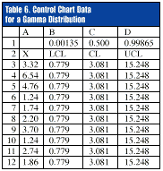
The X chart control limits are [0.779, 15.25]. These are not the mean ±3 sigma, but the lower and upper 0.135-percent tails of the gamma distribution. The false alarm risk for a traditional Shewhart chart is 0.135-percent at each control limit. The centerline is 3.081, which is not the mean but the median (50th percentile) of the gamma distribution. Excel has no built-in routine for fitting a gamma distribution to raw data, but it can compute its percentiles. Table 6 shows the raw data and the calculated control limits for the first 10 points. The formula for cells B3 to B32 is =GAMMAINV(B$1,1.625,1/0.558)+0.74. Excel computes the 0.00135 percentile for a gamma distribution with
Summary Common spreadsheet software can handle traditional Shewhart control charts even when sample sizes vary. The latter feature is beyond the capability of most commercially available SPC packages. A spreadsheet can also perform the Western Electric zone tests. A programmer can add extra features, like a test for unreasonable data. A standard spreadsheet could be adequate for many factory applications. Consider this option before investing in costly, specialized software.
Bibliography Dorner, William W. "Using Excel for Data Analysis." Quality Digest, October 1997, pages 42-46 Levinson, William. 1997. "Watch Out for Nonnormal Distributions of Impurities." Chemical Engineering Progress, May 1997 Levinson, W., and F. Tumbelty, 1997. SPC Essentials and Productivity Improvement: A Manufacturing Approach. Milwaukee: ASQ Quality Press
About the author William A. Levinson, P.E., is a staff engineer at Harris Semiconductor's plant in Mountaintop, Pennsylvania. He co-wrote SPC Essentials and Productivity Improvement: A Manufacturing Approach and edited Leading the Way to Competitive Excellence: The Harris Mountaintop Case Study (ASQ Quality Press). E-mail wlevinson@qualitydigest.com . |
| [QD Online] [Project Cost] [Color] [Excel] [Gaging] [Hardness] [Gage Guide] |
|
|
|
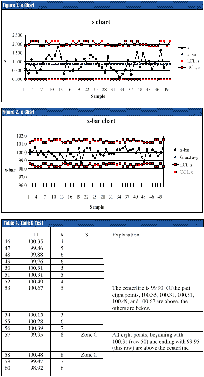
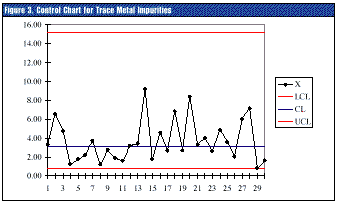 In practice, a point below the lower control limit, and especially below the threshold parameter, suggests a successful process improvement that reduces impurities. A point above the upper control limit suggests an assignable cause resulting in excessive impurities. The Western Electric Zone C test (eight consecutive points above or below the centerline) can be applied here. The false alarm risk for this test is the same as for a Shewhart chart for a normal distribution because the centerline of both charts is the population median. (A normal distribution's mean is also its median.)