spctoolkit
Which Chart Should I Use?
by Donald J. Wheeler
In the previous columns, we saw examples of the basic control chart for
individual values. This chart is recommended whenever you obtain data one
value per time period, or one value per shipment.
The second major type of control chart is used when the data have been
arranged into subgroups. Here we are typically concerned with data where
several values are obtained in a short period of time. For example, an auto
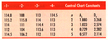
plant in Portugal received shipments from a supplier in Germany. The part
was a piece of wire for connecting the horn buttons to steering wheels.
These wires were supposed to be 100 mm long. Every time they received a
shipment, the Portuguese selected five wires and measured the lengths. The
data for the first four shipments and a table of control chart constants
are shown below:
A "subgroup" should consist of a set of measurements which, in
the user's judgment, represent essentially the same set of conditions. The
concept here is that while each subgroup should be more or less homogeneous,
the control chart will examine the data to see if there are differences
from one subgroup to another. In this example, each set of five measurements
came from one shipment. The pieces of wire in each shipment were made in
the same short production run and under essentially the same conditions.
Therefore it is logical to make each shipment a subgroup.
With subgrouped data, we plot the subgroup averages and subgroup ranges.
Therefore, we must begin by computing averages and ranges for each subgroup.
For each shipment, the average of the five values will be the subgroup average.
The range of a subgroup will be the difference between the maximum value
and the minimum value in that subgroup. For the first shipment, the maximum
value is 115.2, while the minimum value is 112. Thus the subgroup range
is: 115.2 p; 112.0 = 3.2 units.
After the average and range have been computed for each subgroup, these
values are plotted in two running records. Conventionally, the averages
are plotted on the upper running record and the ranges are plotted on the
lower running record.
The limits for this average and range chart are computed from the data
according to the following steps:
The average of the subgroup averages is obtained. This value is called
the grand average. Here the grand average is 112.45. This value will be
the central line for the upper portion of the chart.
The average of the subgroup ranges, called the average range, is also obtained.
Here the average range is 4.725. This value will be the central line for
the lower portion of the chart.
The control limits for the average and range chart are computed using the
grand average and the average range. The upper control limit for the average
chart will be:
Grand Average + (A2 times Average Range)
= 112.45 + (0.577 x 4.725) = 115.2
The lower control limit for the average chart is:
Grand Average p; (A2 times Average Range)
= 112.45 p; (0.577 x 4.725) = 109.7
The upper control limit for the range chart is:
D4 times Average Range = 2.114 x 4.725 = 10.0
where A2 and D4 are the appropriate control chart constants for a given
subgroup size. They are those values which allow us to convert the grand
average and the average range into control limits.
As may be seen on the average and range chart, one average and one range
fall outside their limits. Shipment Two has a lower average and a greater
range than the other shipments. Due to the way the data were arranged into
subgroups, the average chart characterizes each shipment's location-the
average length of the wires in that shipment, while the range chart characterizes
each shipment's consistency-the dispersion of the lengths of the wires in
each shipment.
Clearly, the four shipments have different locations and dispersion. Moreover,
since the target is 100 mm, all shipments were far above the target. Based
on this record of inconsistency, both within and between the shipments,
the German supplier was dropped. The other suppliers were much more consistent
in the product they delivered.
This example serves to introduce the second of the two major types of control
charts-charts for subgrouped data. When several values are collected under
essentially the same conditions, it is logical to place these values in
subgroups and use an average and range chart. The key to effective average
and range charts is to have subgroups that are internally homogeneous. This
is, of course, a judgment made by the user. It is the means by which users
get to bring their process knowledge to bear upon the chart.
When the data are collected in such a way that each value may differ from
the others, it is logical to place the data on a chart for individual values.
This commonly occurs when the values are obtained individually.
While there are other types of control charts, they are all special cases
of the two charts above. They are either charts for subgrouped data, or
charts for individual values. Once you have learned how to use an average
and range chart and a chart for individual values, you can work with virtually
any type of data, in any type of situation.
About the author . . .
Donald J. Wheeler is an internationally known consulting statistician and
the author of Understanding Variation: The Key to Managing Chaos and Understanding
Statistical Process Control, Second Edition.
© 1996 SPC Press Inc. Telephone (423) 584-5005.