Homepage
 Johnson Space Cntr.
 CE: Medical Devices
 Highway Workers
 Academic Partners
 Consulting Guide
 First Word
 Letters
 News Digest
 Quality Mgmt.
 One Minute Mgr.
 Quality Standards
 SPC Toolkit
 Book Reviews
 Quality Software
Picture Picture
Picture
 SPC Toolkit
Picture

46 Men and a Test


by Donald J. Wheeler

Forty-six men were given a skills test involving a task that these men performed every day and at which they were already proficient. The goal was to determine who was the best.

To better discriminate within this large group, the skills test was given to each person a total of four times. However, in order to eliminate any fatigue effects, the four tests were given on four different days. The four test scores for each individual were then combined to get an average score for each person, and these average scores were used to rank the 46 men.

In order to place data on a control chart, it is important to understand the structure of the data and the different sources of variation present in the context for the data. The 184 test scores described above have two obvious structures. First, differences in scores for a single person represent the natural variation present when a person performs the same task multiple times. We call this day-to-day variation.

Second, differences in scores between people will represent the difference in the skill levels. We call this "person-to-person differences."

The purpose of the skills test is to detect the person-to-person differences. The obstacle to doing this is the day-to-day variation. So we need to filter out the effects of the day-to-day variation before we can detect any person-to-person differences. And we may do this with an average and range chart.

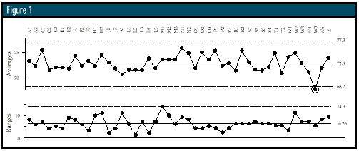
If we combine the four test scores for each person together, and let different people define different subgroups, we will end up with 46 subgroups of size four for our average and range chart.

Picture

The range chart always checks for consistency within the subgroups. In this case, the variation within the subgroups is the day-to-day variation. Thus, the range chart will check to see if all 46 individuals show the same amount of variation when they perform the same task repeatedly. If a person should have a range value that is above the limit on the range chart, then that person could be said to have detectably greater variation in the way he performs the skills test.

No ranges fall above the limit of 14.3, so we may conclude that all 46 men show the same amount of day-to-day variation in performing this task.

The average chart always looks for differences between the subgroups. In this case, when we go from subgroup to subgroup, we are changing persons. Thus, the person-to-person differences will show up on the average chart.

Because it is the average range that is used to compute the limits for both charts, the limits will reflect the uncertainty due to the natural human variation in performing this task. Thus, the limits on the average chart define that amount of variation in the average scores which can be attributed to the natural variation inherent in performing this task repeatedly.

In order for one person to be said to be detectably above average -- or detectably below average -- in his proficiency at this task, he will have to have an average that is outside the control limits on the average chart. Those with averages that fall within the limits must be said to be indistinguishable from each other.

Forty-five of the individuals have averages that fall within the limits of 68.2 to 77.3. One man, with an average of 67.5, shows a detectably different level of proficiency. His different level of proficiency cannot be explained by the normal, day-to-day variation that covers all the other person-to-person differences.

Now that you know what these data are telling you, it is time for the rest of the story -- these data are the scores for the 1997 Master's Tournament. You can get the data from the golf portion of the sports section of any newspaper for April 14 -- but then you probably already know who was detectably different from all the rest.

Can you see how the average chart tells you why par is 72? And can you express in words what the average range of 6.26 represents? The answers to these two questions will help you learn how to use Shewhart's charts more effectively.

About the author

Donald J. Wheeler is an internationally known consulting statistician and the author of Understanding Variation: The Key to Managing Chaos and Understanding Statistical Process Control, Second Edition. © 1997 SPC Press Inc. Telephone (423) 584-5005 or e-mail dwheeler @qualitydigest.com.

Picture
Picture
Picture

e-mail Quality Digest

Copyright 1997 QCI International. All rights reserved. Quality Digest can be reached by phone at (916) 893-4095.

Please contact our Webmaster with questions or comments.

[Homepage]

[Current Issue]

[ISO 9000 Database]

[Daily News]

[Phil's Journal]

[Quality Leadership]

[Past Issues]

[Quality Web]

[Information]

[Media Kit]

[Subscribe]

[Guestbook]