Taking Count Data a Step Further
In last month's column ("A Common-Cause Strategy for Count Data"), I showed how a matrix presentation of count data could be quite effective as a common-cause strategy. I'll use this column to review some key concepts of count data as well as demonstrate the first of two common techniques that can be useful for further analysis. Obtaining the counts is only half of the job.
What's the threshold whereby something goes from a "nonissue" (i.e., a value of 0) to an "issue" (i.e., a value of 1)? Would two or more people assessing the situation concur that the "issue" had occurred?
In addition, all count data have an implicit denominator that's defined by the "area of opportunity" for that count. It depends on what's being counted, how it's being counted and what possible restrictions there might be upon the count.
A hot topic in health care improvement right now is eradicating hospital-acquired infections. One can obviously count the number of infections, but what should the denominator be? The following possibility is quite simple: One could, at discharge, count the number of patients who acquired an infection. This could be expressed as a percentage, and one could obtain perfectly reasonable numbers.
However, even though one can obtain a number, hospital personnel would say that defining the occurrence of infections that way is flawed. For example, a common way for patients to acquire infections is through having a central line during one's hospital stay. By looking at infections rather than patients, one can count the number of infections, but one can't really count the number of noninfections because exposure to the possibility is constant--i.e., the longer the line is left in, the more of a chance the patient has to acquire an infection. Thus, in this case, the denominator must somehow express the time the patient was potentially exposed to having an infection. Rather than a percentage of patients, it's now considered as a rate of, say, infections per 1,000 central-line days.
Last month's accident counts made an implicit assumption that the window of opportunity was approximately the same for each department and for each month when plotting the individual monthly results--say, labor hours, for example.
Let's instead consider infections for specific hospital units, each having a different size as shown by the number of central-line days for each unit.
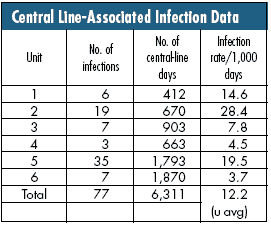
The denominator was crucial for properly defining the situation and subsequently interpreting the differences in the resulting rates. If you don't know the area of opportunity for a count, you don't know how to interpret that count.
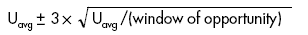
In the instance of rate data, the statistical u-chart is appropriate to answer everyone's basic question: Are the three above-average units truly above average?
One must assume that each unit has a rate of 12.2/1,000 central-line days unless its individual data indicate otherwise by falling outside the common-cause limits of what would be expected due to statistical variation and given their number of central-line days.
The general formula for the common-cause range of rates is:
(The 3 stands for "3 standard deviations," which will be explained in a future column on analysis of means.)
In this case, your formula is:
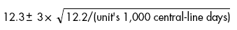
(Note that the only difference for each unit is the number of central-line days.)
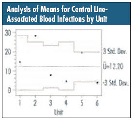
This results in the chart below. One unit is truly above average (Unit 2), and one unit is truly below average (Unit 6). The others, based on this data, are indistinguishable from each other and 12.2. Once again, always be aware of how the data were collected. The raw-count numbers might be useful, but putting them in their statistical context can present another critical view of a situation.
Davis Balestracci is a member of the American Society for Quality and the Association for Quality and Participation. He previously served as chair of the statistics division of ASQ. Visit his Web site at www.dbharmony.com.
|