Social Sharing block
I recently closed the doors of my own consulting company on the prairie in Minnesota and headed back into the wild, wacky, wonderful world of larger consulting groups, joining a group in Northern Virginia. One of the consequences of that transition was that I was unable to meet a couple of speaking engagements, so I promised to write something about dashboards for the people who had planned to attend. This dashboard issue is one of the more egregious problems I see regularly.
|
ADVERTISEMENT |
Although I can’t really put that whole presentation in writing, I can at least discuss the problem. The presentation was actually a half-day workshop that included W. Edwards Deming’s Red Bead experiment as an opening, followed by a discussion and brief overview of statistical process control (SPC). I see so few people using SPC anymore; most of the companies I work with measure very little and use their data badly. I wanted to include the Red Bead experiment because I consider it a prerequisite, the price of entry. If you understand the red bead, you’d probably never use an idiot-light dashboard.
I suppose it dates me to call these red-green dashboards “idiot lights.” OK, no supposing—it dates me. For you youngsters out there: Back in the old days, one of the options when you purchased a car was a choice of either actual instruments to measure water temperature and oil pressure, or lights that would come on when they were dangerously high or low. In those days, we actually worked on our own cars. We changed the oil, tuned it up every few thousand miles, and flushed the radiator twice a year. Your toolbox was incomplete if you didn’t have a gap gauge (for setting points and plugs), some chalk, and a timing light. There was a chrome-and-plastic tire pressure gauge in almost every glove box.
In those days, knowing the thresholds for your oil pressure and engine temperature were important, so being able to see when they were trending toward the danger zone was a good thing, a necessary thing. Mechanical engineers like my dad and many shade-tree mechanics sneered when Detroit started replacing gauges with indicator lights—hence the term “idiot lights.” I remember car salesmen asking my father if he wanted gauges or idiot lights when he ordered a new car in 1965.
I had the same reaction when I saw an operational metrics dashboard a few years ago that had the “stoplight” indicator. It was hard for me to believe that any manager would decide to ditch all the decision power and knowledge that SPC brings in favor of a colored dot that would just indicate hitting or not hitting a target.
One specific situation sparked my would-be presentation. I was consulting with a large company, working with one of their business units in the role of a Six Sigma Master Black Belt. As a result, I was invited to many management meetings. One regular Thursday meeting concerned a metric that management cared about deeply. Each week, one manager who “tracked” this metric would show the dashboard, then present some conjecture on why the metric was either above the target or below it. If they were above the target, the director would congratulate everyone; thank them for all their hard work. If they were below, the director would ask where everyone thought the problem might be. Usual red-green stuff. The dashboard essentially looked like this:
![]()
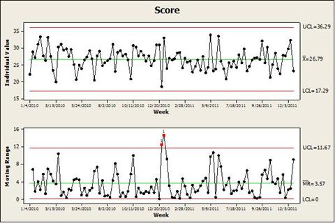
As it happened, most of these same people also came to a Friday meeting that I had some responsibility for. I had asked for the historical data, and so each Friday, I presented an individuals and moving range chart of these data.
You could even do a capability study with these data, using the target of 28 as a lower specification limit:
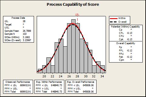
Now, anyone who understands the lesson of the red bead knows—with just a casual glance at the process behavior chart—that this process will produce many weeks above the target. They also know, though, that it’s going to produce even more weeks below the target. The metric has been essentially stable for two years, with the centerline just about straddling the target (but just below). The capability study predicts that they’ll be below target about 65 weeks out of 100. The one assignable cause in the moving range chart was due to an exceptionally low week during the Christmas holidays.
So, every Thursday, we’d see the red or green, and we’d pass out wrist-slaps or T-shirts. During red weeks, there would be some furious activity to find out what happened, and take some swift action to tamper with the system. During green weeks, everyone rested on their laurels. So, at least during green weeks, no one was trying to make things worse!
Then, the next day each week, I’d present the latest process behavior chart and capability study. I’d point out that the company was still in statistical control, and that the average was still below the target line. I’d show the capability study and explain that the numbers there predicted that in any given year the company could expect to be below target more than six weeks out of every 10. I’d tell them that things were going to stay this way until someone decided to actually work on the system of causes that was driving the metric. I was usually met by polite silence, with the director eventually saying, “Thanks for that, Rip... anyone have anything else?”
Finally, one brave soul spoke up and said, “Wait a minute. Are you saying that all this stuff we’ve been doing hasn’t helped? We haven’t improved at all?” That opened the floodgates. By the end of that meeting, management had decided to charter a project to look at the overall system and learn what would have to change to move the lower control limit above the target. I was invited to present the control chart each week at the metric meeting (and to the director’s vice president).
I wish I could tell you what happened from that; shortly after that, I was transferred to another business unit, and then the organization ran out of consulting budget. I did hear from the woman who had been tracking the dashboard (and had taken over the control chart), and she said they had at least moved the mean above target, but she didn’t send me the updated chart.
What do we take away from this?
We do pull beads out of a bin. I have presented the red bead experiment hundreds of times during the past 20 years. It almost never fails that someone will say, “Yeah, that was cute, but I don’t pull beads out of a bin for a living. This doesn’t apply to me.” It’s a little like the Oakland scout telling Billy Beane that he should be relying on the experience and gut of his scouts rather than “Pete’s” (Paul de Podesta’s) statistics.
Of course most of us don’t literally pull beads out of a bin. What we actually do can usually be measured, though, so we produce numbers as well as widgets or services. The processes that produce both widget and number are the result of a system of causes. Some of the causes are related to people, some to machinery or technology, some to policy or environment, some to incoming materials—the list goes on and on. Some of these factors can be economically controlled, and some can’t. Until a manager understands the system as a whole and begins to understand all the drivers and interactions in that system, it might as well be pulling beads from a bin because in that case, management has no more control over the results than the foreman in the red bead experiment.
Idiot lights don’t help. Especially when the threshold is arbitrary. The light blinking red and green drives tampering when it’s red, and ignorance when it’s green. There is often (as there was in this case) confusion about what the target even means. When the manager is told to “hit the number,” does that mean hit it every week? That means we need to get the process to a point where the target is outside the control limits. Does it mean hit it on average? Then we need to shift the mean to one side of the target or another. Once we can show that the process is stable, with the mean on the “good” side of the target, we’ve “hit” the target. Just knowing that I’m above or below target doesn’t help me, though, if I don’t know the capability of my process—and I can’t know that from the idiot light.
I did say, “Especially when the threshold is arbitrary.” In the case of my director, as in many other cases, the target was arbitrary and was set on someone’s idea of how much improvement this particular director’s group could be driven to achieve in the fiscal year. The sad fact is that, had she “hit” the target in her yearly expectations, the target would no doubt have been adjusted upward by some other arbitrarily guessed amount for the next year, without the benefit of anyone in leadership knowing any more about the process than they did the last time they winged a target into her expectations.
Myron Tribus, former director of the Center for Advanced Engineering Study at MIT, described this practice particularly well: “... In short, [most leaders’] idea of a good manager is one who sets up a system, directs the work through subordinates, and by making crisp and unambiguous assignments develops a basis to set standards of performance for... employees. [The leader] sets goals and production targets [and] rates employee performance objectively against those targets.” This sounds great, but Tribus’ point is that without the benefit of understanding systems and variation, the targets will be wrong, the rating system will be useless, and the manager’s decisions and actions will produce more harm than good. Tribus was also known for his “perversity principle”: “If you try to improve the performance of a system of people, machines, and procedures by setting numerical goals for the improvement of individual parts of the system, the system will defeat your efforts, and you will pay a price where you least expect it.”
The 85-percent (96%) rule still applies. Deming used to say that 85 percent of the performance of any system belongs to management. During his last few years, he often joked that he’d underestimated that number all along; it should have been 96 percent. His point was that most of the performance of any system is driven by a lot of factors and interactions between them, but most of the management action that he saw was directed at the people working in the system. Managers who ignore the interaction of forces and variation are thus going to be wrong about 85 percent of the time. Heero Haqueboord (president of Decision Partners Ltd.) once joked that we could improve most companies’ performance by 35 percent, if we could just get all their managers to flip a coin when they have to make a decision.
Your world is not red or green, and your dashboards shouldn’t be, either. The purpose of measuring important aspects of a process is to be able to predict how the process is likely to perform, and to be able to make decisions on what to do about that performance. The real world doesn’t give us red or green any more than it gives us black or white. It gives us a whole spectrum in between; although we might have acceptable and unacceptable thresholds somewhere along that spectrum, managing to that threshold requires that we understand where we are in the spectrum—and how wide the spectrum is. Control charts are a great tool for understanding those things.
Is it more difficult? Sure, it’s at least a little harder. Any monkey can be trained to do a flip when the light comes on; I just believe that most managers and executives are a lot smarter than most monkeys, and more should be expected of them. I’m always a little distressed by people (who should know better) who tell me that control charts and SPC are just “too complex” for most managers. Most managers (and most line workers) I’ve met have more than enough intelligence to understand the basics of variation and can readily be taught to use control charts—yes, even to use them well. So let’s start giving managers and executives the actual gauges on their dashboards that will let them understand performance and improve systems, instead of a collection of idiot lights that they can react to.
Comments
An excellent summary of a process approach
Thanks!
Thanks, Jeff...I'd assign it for homework, maybe, after they'd seen the red bead...
not just for managers
Nice article, but the intent shouldn't be applied solely to managers. Anyone having to search for and resolve an issue within a process should have access to the data trends, be encouraged to understand thier meaning and tasked to generate measurable results.
I couldn't agree more
It's interesting to me to be told often that "well, the control charts are just too complex...we need to make it simple for managers." I'm not sure what they see as complex...when Larry Sullivan first saw a group of Japanese workers discussing a control chart at Tokai Rika back in 1981, they were line workers...not company statisticians or consultants. While I completely agree with you that it should be just as you describe, I have found very few managers at any level in any organization who knew how to use data to manage their processes.
As an example, the manager of a pretty high-volume aluminum-cutting operation in a good-sized factory told me that yield was killing him...he just couldn't seem to get yield up high enough to make his operation profitable. I asked him, "So, what is the yield in this process?"
He replied, "I'm not sure...last quarter it was down around 73%." (There were only three weeks left in the current quarter).
I told him I wasn't interested in last quarter's numbers..."What is the yield today? What was it yesterday? Is it stable?"
He looked at me like I was an idiot, or an alien, or something. "I don't know what it is today, why would I know that? The quarterly numbers are what counts!" I told him yield would no doubt continue to kill him, and that things would stay just as they are until he decided it was important enough to study more than one day a quarter.
So while my intent isn't actually solely applied to managers, I think I have to try to reach them first. They are going to be the ones who have to implement the systems; they are the ones who decide what will comprise their dashboards.
Thought Provoking
redundant entry - sorry
Thought Provoking
I had not anticipated that anybody would be goofy enough to set green and red (and even yellow) boundaries while utterly ignoring the concepts of common and special cause - but I suppose I should have. Nor did it occur to me that the zones might be set based on spec limits instead of process capabilities - but again, I suppose I should have.
I could possibly defend the color zones if they are based on the modified rules of pre-control -- yellow starts +/- 1.5 s from mean, red starts +/- 3 s from mean. This interpretation rectifies the critical vulnerability in the original pre-control, where the colors used to be set by spec limits rather than process performance.
However, I cannot and will not try to justify "idiot lights" as a replacement for a control chart with thoughtfully designed rational subgrouping.
I have a Facebook page I call "Quality Face Palm," where I describe immense blunders made in the name of quality. I would like permission to add the link to this article in that page.
Link away, Jandel!
You have my permission, and I'm sure Dirk won't mind...thanks!
Thoroughly enjoyed article
Thoroughly enjoyed the article. Wish more would read it and even more would take the lessons to heart. I'm sure you've "been there" where they maybe get it and maybe don't but continue to do something else, anyway. I think that's because the something else is the easy way and the right way takes understanding (requires knowledge - as Deming would say).
On a separate note, I'm sure you probably don't remember me from the DEN, but I was a student of some of your collegues in the Navy (and an organization level trainer/advisor myself). I've followed (read) your writing and posting for years, always impressed with your knowledge and ability to communicate the concepts. Keep up the good work.
DEN
Of course I remember you from the DEN, Greg. I miss the DEN...there are several Deming discussion groups around; several in LinkedIn. None, however is like the DEN. I wish now that I had copied all the messages from that group into a file and archived it. For a while, you could get to an archive on the Deming Institute site, but I can't find it there anymore. I've often thought that Jim Clauson could have put together a pretty interesting book (at least an e-book) of some of those threads. When you think about some of the posts, and the people that were writing those posts (Myron Tribus, David Kerridge, John Connelly, Bill Latzko, Frank Voehl, Mike Tveite), and the contributions many of them made (Myron and David sometimes wrote pages each day)...it was the leading edge of the quality literature in those years.
Terrific article
Do you think we'll ever be rid of the horror of Cpk and Ppk, which are fatally flawed IMHO by the inclusion of the spec limits (I have yet to see spec limits that were statistically validated, and even if they were they still suffer from being static criteria in a dynamic universe). The simple question is: what kinds (centrality, dispersion, etc.) and values of variation are appropriate and how do we meet them? This would bring engineers out of the safe, tidy world of drawings and cad files and change boards and such, but while the establishment of real feedback loops and the resources to support them might be painful for people and organizations, the harsh light of day can only help in the long run.
I'm reminded of the time I worked for a division of an american conglomerate that put its name on a pale imitation of TPS. We were visiting a sister plant that made fasteners and other tiny high-volume parts. IIRC, most of the shop floor was covered in woo (WIW - work in waiting; I just made that up). Our host remarked that they wanted to buy more machines but they didn't know where they would put them!
Great story, Dave
Your "woo" (I like that better than wip...I'll use that!) story reminded me of a company I worked with for a while...they were trying to learn TPS, and had asked me to come in for sort of a progress check. They had a 16-acre warehouse that they had built just to hold the excess woo that they couldn't find room for in the manufacturing plant. The founder of the company had pronounced, back in the '40s, that "Inventory is the price of good customer service."
One of the guys I was working with told me that, at one operation, they had needed a few hundred pieces of machined material. There were several pallets of it in the warehouse (already processed, waiting to be used). They sent someone looking for it. He found the material, but it was buried in the middle of a huge block of other material, and they estimated that it would take them more than a day to shift all the other stuff around so they could get to it (this in addition to the half-day the guy already spent searching). So they decided it would just be quicker and easier to machine a fresh pallet...
Yikes!
My opinion of your client's operation includes the word "cluster". I hope they manage to shift their paradigm before it's the '40s again. Sadly, in industry incompetence doesn't guarantee extinction.
Another QD Article on stoplight scorecards and an alternative
Add new comment