P-Charts and U-Charts Work (But Only Sometimes)
by David B. Laney
We've all seen them: control charts for attributes (p-charts and u-charts) where the control limits "hug" the mean but the data points are all over the place. It seems to happen more often when the subgroup sizes are very large. This phenomenon is called "overdispersion" and was well known to the Old Boys at Western Electric back in the 1950s. They told us it was because the "constant parameter" assumption required for these charts is not always valid. Sometimes there is "batch-to-batch" variation in such data sets. (Some days it's hot and some days it's cold.) Not to worry, they told us, just use an individuals (XmR) chart when this happens. Problem solved--sort of.
The problem with using an XmR chart for attribute data is that there can be a significant amount of statistical bias if the subgroup sizes vary a lot. If this is the case, is a point outside the control limits really a special cause or did it just come from a relatively small subgroup, wherein more variation should be tolerated? In other words, we lose the "wiggly" control limits needed in such charts.
A number of scholarly papers have appeared over the years to give "diagnostic tests" for this condition. But now we have a cure, and it is unbelievably simple.
Remember the old z-chart? It plots z(i) = [ p(i) – p-bar]/ s[ p(i)]. And since we "know" that z-bar = 0 and s (z) = 1, the center line is easily drawn at 0 and the control limits set at ±3. But if there is overdispersion in the data, this does not help; the limits still crowd the mean while the data points do not.
The solution lies in Donald J. Wheeler's familiar admonition: "Why assume the variation when you can measure it?" Instead of assuming that s (z) = 1, why not actually compute it? To comply with Walter A. Shewhart's rule that we should use "short-run" variation, we get it by taking the average moving range of size 2 and dividing by 1.128--just as we do in an XmR chart. If there is overdispersion, this sigma will be greater than one; this value happens to be the relative amount of variation in the process that is not explained by the binomial (or Poisson) assumption alone. Think of it as the "between-subgroups" component of the total process variation. Because we used the moving range method to get it, it is still short-term variation. As Roger Hoerl told me, this method merely revises our definition of "rational subgroups" for this process.
If the z-chart is retransposed back into the p-plane, it turns out that the formula for the control limits in this new p'-chart is UCL/LCL = p-bar ±3 s (p) s (z).
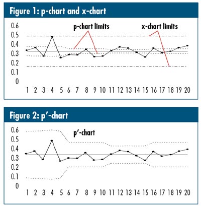
Figure 1 shows traditional p-chart and XmR chart renderings of a data set that suffers from overdispersion. Figure 2 shows the same data in a p'-chart. Note that these limits are "out where they should be" as suggested by the XmR chart, and they "wiggle," as in the p-chart, in response to unequal subgroup sizes. It can be shown that if a data set really is purely binomially distributed, the p'-chart is exactly the same as a p-chart. Also, if all subgroup sizes are the same, the p'-chart is exactly the same as the XmR chart.
My life's goal: Let's get this into Minitab!
Note: This article is based on "Improved Control Charts for Attributes," by this author, appearing in the Volume 14, No. 4 (June), 2002 issue of Quality Engineering .
David B. Laney is a semi-retired statistics professor, quality engineer and Six Sigma Black Belt in Birmingham, Alabama. After 35 years of full-time work, he now dabbles as a part-time consultant, instructor, lecturer and "statistical evangelist."
|