| by Randall Johns and Robert Watson
The power of the computer has had a tremendous effect on the business community. Today we have far more computing power sitting on our desks, or in our luggage, than most scientists had in their labs before 1980. Since then, we’ve witnessed an explosion of personal computers, with an ever-
proliferating number of more sophisticated applications.
This is one of the major influences that led to the implementation of current Six Sigma programs. Six Sigma combines many existing concepts and methods, and incorporates statistical analysis in varying degrees. This is made possible by the facilitation of statistical calculations by applications running on PCs. Although these applications run the math, it’s still incumbent on the practitioner to understand the internal workings of the software. This article examines just a few of the issues with using today’s statistical applications.
Although these applications make it much easier to run analyses, they do not come with the ability to choose the correct tool or interpret the results. Statistical applications can streamline the user’s learning curve, but it’s still important to understand that not all statistical applications are the same. The proper outcome of a test can depend on the selection of the test setup.
When looking at all the tools and methods that have been packaged in the training programs offered by most suppliers, one might conclude that Six Sigma is actually a clever arrangement of long-available techniques. Some of these tools include failure modes and effects analysis (FMEA), flow diagrams, cause-and-effect diagrams, design of experiments, measurement system analysis and control plans. Statistical tools might include analysis of variance (ANOVA), t-tests, proportion tests, contingency tables and a variety of nonparametric tests. All of these techniques have been around for at least 70 years, although many continue to be updated as new ideas are applied. An example of this would be the latest (third) edition of
FMEA as described in the Automotive Industry Action Group manual, which incorporates the concept of prevention techniques in addition to detection techniques in the consideration of process controls.
However, when considering Six Sigma as a problem-solving methodology, you’ll find some tools included that once required statisticians or quality experts to interpret. Today the PC has made it easier to perform the more complex statistical analyses. The most complicated part of running an analysis is organizing the data; after that the computer performs the analysis almost instantaneously. In the past, primary users of these applications had been researchers and quality professionals, but Six Sigma programs have greatly added to the numbers of users. Now we need to include problem-solving teams made up of people with a wider variety of proficiencies.
Let’s first look at a fairly simple example. The analysis tool to be examined is the box plot, illustrated in the basic box plot figure below.
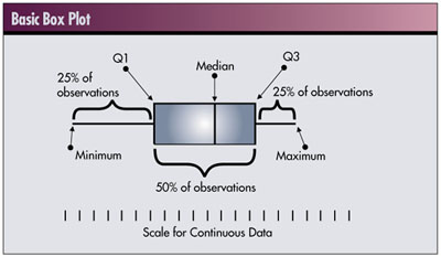
As you can see, a typical box plot has three major elements: the central box, two attached “whiskers” that extend in opposite directions from the central box to the extreme values and the median value. When drawn against a scale appropriate for the data values to be summarized, the central box shows the region along the scale in which 50 percent of the observed data resides. The remaining 50 percent of the data are found inside the ranges represented by the whiskers, equally distributed in each.
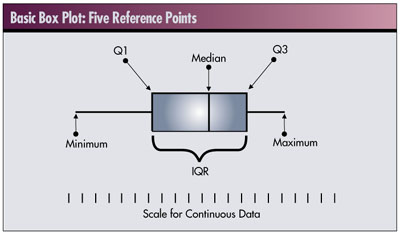
It should be somewhat obvious that to construct a box plot we need to know the endpoints of the central box, the endpoints of the two whiskers and the median. These five reference points are referred to as the five number summaries of the data. (See R.V. Hogg and E.A. Tanis, Probability and Statistical Inference, sixth edition, Prentice
Hall, 2001.)
The five points, indicated in the lower box plot, are the median, the first and third quartiles (Q1, Q3), the lowest (minimum) value and the highest (maximum) value. Not all of these numbers are necessarily observed data values. In particular, the median, Q1 and Q3 values may be interpolated and will depend on the number of data values.
This is where consensus departs. Although all box plots are interpreted in the same way, the actual values used for the quartiles, Q1 and Q3, differ in practice. There are three methods for obtaining the five number summaries.
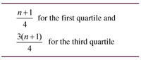
 Joseph M. Juran’s approach is formula-driven, and the first and third quartiles are defined by the following equations: Joseph M. Juran’s approach is formula-driven, and the first and third quartiles are defined by the following equations:

MINITAB’s approach (portions of MINITAB’s input and output are printed with permission of Minitab Inc.), as well as that of other statistical software packages in determining the interquartile range (IQR), is likewise formula-driven. Using these formulas the IQR will sometimes hold more than 50 percent of the observed data values, sometimes less. The actual percentage varies according to the sample size. MINITAB’s formulas for the quartile values are:
John Wilder Tukey’s approach produces a five-number summary that is consistent with Juran’s for even-numbered data sets, but his IQR is actually smaller than Juran’s for odd-numbered data sets. At first this seems illogical, but there is an elegant symmetry to Tukey’s method as defined below:
- First, find the median. This is the middle hinge or 50-percent line, the value exactly in the middle in an ordered set of data.
- Next, find the median of the upper half of the data values whose ranks are greater than or equal to the median. This will be a data value, or it will be halfway between two data values. This is the upper hinge.
- Finally, find the median of the lower half of the data values whose ranks are less than or equal to the rank of the median. This will be a data value, or it will be halfway between two data values. This is the lower hinge.
Note that the median will be included in both the upper and lower halves when there are an odd number of values. This is the area where Tukey and Juran are dissimilar. Tukey’s method is always different than MINITAB’s.
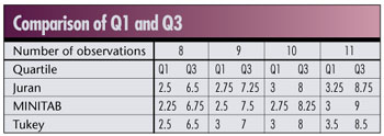
Following is a summary comparison of these three methods by identifying what lower and upper quartile rank each method obtains for data sets of eight, nine, 10 and 11 points, respectively. Four consecutive numbers were utilized because they should mimic any possible scenario of quartile points due to the division by four in the Juran and MINITAB equations.
The figure below is a graphical summary of the IQR, or H-spread for hinges, for each of the three methods. (See A.J. Duncan, Quality Control and Industrial Statistics, fifth edition, Irwin, 1986.) We used a data set of 11 points (12, 14, 15, 16, 17, 19, 20, 20, 21, 22 and 24). This will highlight the differences in the length of the IQR for each of the methods.
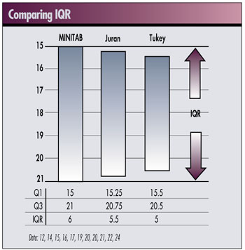
Any difference in the values of Q1 and Q3 result in differences in calculating the IQR or H-spread, which may affect the treatment of the smallest and largest data values, identifying them as outliers in one method but not in another. If outlier data points are eventually removed, this could have a much more significant effect on the final box plot used to graphically summarize the data. Because this graphical summary is used to make judgments on the process, these small differences could have a major effect on the conclusions about the process.
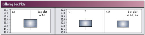
The two box plots below use the same data. The left box plot uses calculations for Q1 and Q3 using a formula-based approach and is the default in MINITAB. The right box plots use the concept of hinges, which in MINITAB can be selected under the Tools>Options>Individual Graphs menu. Looking at the right graph, the box plot labeled C2 in the right panel would result if we removed the outlier identified in box plot C1 in the left panel. Using the default approach in MINITAB gives a different result.
Users need to be aware of the methods used in their particular applications. They may differ from a previously learned method.
Next, let us examine capability studies. There are general formulas for calculating capability. For example, the short-term capability index is calculated as:
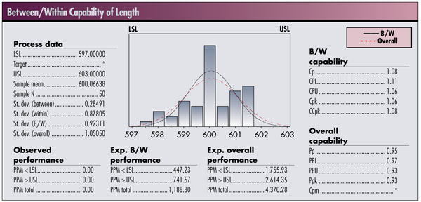
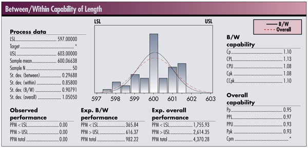
This calculation requires a value for s (or s ). One way to get a standard deviation would be to calculate the standard deviation from a given data set. In the book Measuring Process Capability (McGraw-Hill, 1997), D.R. Bothe discusses the development of estimates from capability studies and distinguishes between a short-term estimate of variation ( s 2 ST ) and a long-term estimate ( s2 LT ). He equates the within-group variation ( s2 WITHIN ) with short-term variation, and the sum of the within-group plus the between-group ( s2 BETWEEN ) as the long-term variation.
The question to the user of the application is, “How does the application treat the determination of these standard deviations and the resulting capability numbers?”
The analysis in the first figure below estimates the within-group variation based on the pooled estimate for standard deviation. In the second figure, the estimate of within-group variation is based on R-bar (average range).
These differences arise from the use of applied statistics vs. theoretical statistics. Theoretical statistics is a subject taught in most college courses on statistics. Course material includes commonly understood concepts such as set theory, probability space, discrete probability, continuous probability distributions, calculation
of statistics, tests of parameters, analysis of variance, regression and experimenta tion.
Applied industrial statistics develops estimates using simpler calculations, tables of coefficients and general rules. They are not as precise but make effective estimates and are closely associated with statistical process control.
Different statistical methods make it vitally important to understand the analysis your software is performing. MINITAB does a very good job of supporting both the theoretical (academic) world and the applied (real) world. The differences discussed here are just some of the challenges faced by users of statistical software packages, and in particular, those who are asked to become familiar enough with their application to achieve Six Sigma certification.
Randall Johns is a vice president for the Juran Institute, based in Southbury, Connecticut. Johns is certified as a Six Sigma Master Black Belt and is a trainer and consultant in root cause analysis, lean manufacturing and quality deployment.
Robert Watson is vice president of supply chain for the Juran Institute. Watson is certified as a Six Sigma Master Black Belt and is a trainer and consultant in lean manufacturing and inventory reductions.
|