Phil looked at the data Joan had just handed him. Joan had recently attended an SPC seminar the company had sponsored for administrative personnel. Because Phil had been the quality engineer who taught the classes, it was only natural that Joan would seek his help. She was trying her best to follow Phil's advice of applying what she had learned to something important to her. "The numbers are the percentage of invoices sent out that contain errors," explained Joan. Phil nodded and took a graphic out of his desk drawer and showed it to Joan (Figure 1). "Remember this?" he asked. "Sure," replied Joan. "It's the decision tree for finding out which control chart to use." 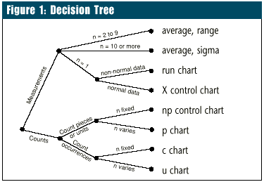
Phil smiled and nodded. He liked teaching and found it especially rewarding when bright students like Joan applied what they had learned. "But it doesn't work for my data," Joan continued. Phil's smile faded. "What do you mean? It has to work." He turned the paper toward her. "Here, let me show you." He placed his finger on the dot at the left of the chart. "Are we dealing with measurements or counts?" he asked. "Counts. They count the number of invoices with errors." Phil ran his finger along the line labeled count until it reached the next dot. "OK, are we counting pieces or units, or are we counting occurrences?" "Pieces or units. They count invoices, which are pieces of paper." 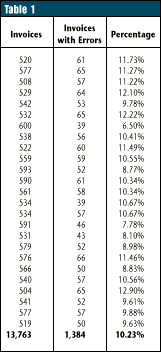 "And the last question is: Does the sample size stay the same, or does it vary?" asked Phil. "And the last question is: Does the sample size stay the same, or does it vary?" asked Phil.
"It varies," said Joan. "Every month a different number of invoices are processed." "Then the correct chart is the p chart," concluded Phil, tapping his finger on the graphic with an air of finality. "Right; that's what I came up with," said Joan. "But it doesn't work." Phil looked perplexed. "Of course it works. Maybe you're having trouble because it's your first real control chart. I'll help you construct it. Where are the data?" Joan pointed to the sheet of paper she'd brought him. "No, I need the raw data," said Phil. "All this shows is the percentages computed from the raw data." 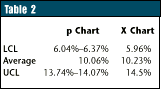
"That's the problem -- I don't have it," replied Joan. "All the sales offices send me are the percentages. They don't even keep the raw numbers." This problem is common. The solution is, of course, to collect data in the proper format. However, this may mean starting from scratch, changing habits firmly rooted in past behavior, expensive training, etc. And it may take months to accumulate enough data to establish valid control limits. These obstacles are often enough to cause people to abandon control charts entirely. Is there nothing Phil and Joan can do? Fortunately, there is a solution: the X chart, also known as the individuals chart or X and moving range chart. Of course, the X chart is recommended when plotting measurement data from subgroups of size one. But it is much more versatile. The X chart is the Swiss army knife of control charts. Under the assumptions of statistical control and constant sample size, the central limit theorem can be used to show that the other control charts are mathematically related to the X chart. Better still, under conditions frequently encountered in practice, X charts can be used to plot percentages, ratios, counts and other nonmeasurement data, even when the assumptions are only approximately met. Assume that Joan has the number of invoices and errors shown in Table1. Figures 2 and 3 show, respectively, the p chart and the X chart for these data. The X chart was created by using the percentages as if they were measurements. The conclusions are the same with either chart: The process is in statistical control. Table 2 shows that the numbers calculated from the data are close, too. 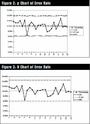
In other words, if all that are available are the percentages, the X chart provides an excellent approximation to the p chart. The same conclusion applies to data for the np chart, c chart, u chart, sigma chart, etc. In all these cases, and more, the Swiss army knife of control charts allows the process operator to focus on data. One could even argue that the simplicity of using a single chart instead of several charts outweighs the mathematical advantages in many cases. So, when in doubt, get the X chart out. About the author Thomas Pyzdek has written hundreds of articles and papers on quality topics and has authored 13 books, including The Complete Guide to the CQM and its accompanying CD-ROM. Pyzdek, who served on the first board of examiners for the Malcolm Baldrige National Quality Award, is president and CEO of Quality Publishing. He is a fellow of the American Society for Quality and a recipient of the ASQ Edwards Medal. If you have any questions or comments for Pyzdek, please e-mail him at Tom Pyzdek. |